Introduction
If you’re looking to create full page navigation tailwind codepen, you’re in the right place. In this blog post, we’ll walk you through the process of building a sleek, responsive full-page navigation menu using Tailwind CSS on CodePen. Whether you’re designing a modern website or a single-page portfolio, this step-by-step guide will show you how to implement an interactive, visually appealing navigation system with ease. Let’s get started!
Table of Contents
What is Full Page Navigation?
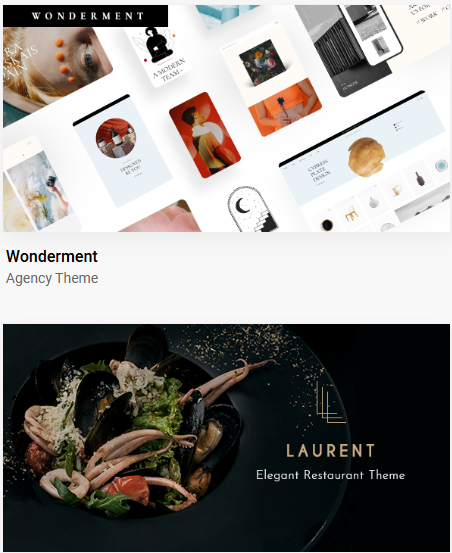
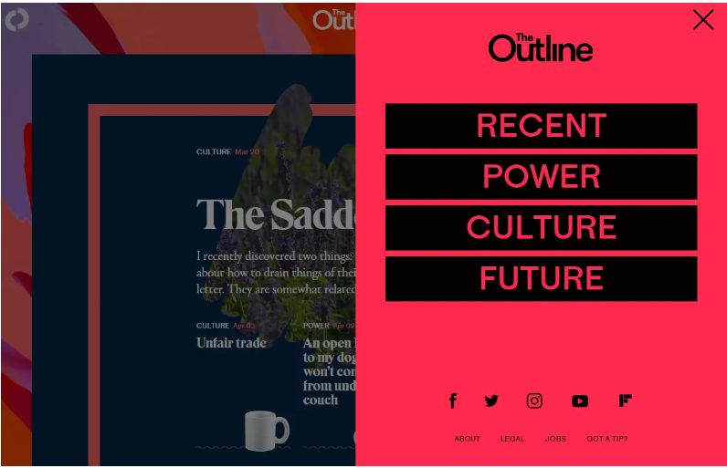
Full-page navigation is a type of navigation menu that takes up the entire screen space when activated. It is often used in modern web design to provide users with a distraction-free browsing experience. The concept has become increasingly popular for single-page websites, landing pages, and portfolios, where the navigation options appear as a full-screen overlay or slide-in menu.
Tailwind CSS, a popular utility-first CSS framework, allows you to quickly build such interfaces without having to write custom CSS from scratch. With a few simple classes, you can create sophisticated designs with ease.
Benefits of Using Full Page Navigation
Using a full-page navigation system has several advantages, especially for modern websites. Here are some of the benefits:
1. Improved User Experience (UX)
A full-page navigation menu provides a clean and organized way to access different sections of a website. Since it occupies the entire screen, it grabs the user’s attention and minimizes distractions, which can improve navigation efficiency.
2. Mobile-Friendly Design
Full-page navigation menus are ideal for mobile-friendly designs. On small screens, space is limited, and a full-screen menu can make the most of the available real estate, ensuring users can quickly find what they need without scrolling.

3. Aesthetic Appeal
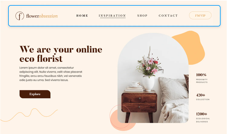
A well-designed full-page navigation can make your website look more polished and modern. Tailwind CSS makes it easier to create visually striking designs that are both functional and aesthetically pleasing.
Tools You’ll Need to Get Started
Before diving into the code, here are the tools you’ll need:
1. Tailwind CSS
Tailwind CSS is a utility-first CSS framework that allows developers to build custom designs without writing complex CSS. It comes with a rich set of predefined classes for spacing, layout, typography, colors, and more, making it an excellent choice for quickly prototyping UI components like navigation menus.
2. CodePen
CodePen is an online code editor where you can write, test, and showcase HTML, CSS, and JavaScript. It’s perfect for experimenting with small web projects, including creating interactive navigation menus. CodePen also allows you to share your work with others and collaborate on coding projects.
Step-by-Step Guide to Creating Full Page Navigation with Tailwind CSS
Now that you have your tools ready, let’s dive into the actual implementation of a full-page navigation menu using Tailwind CSS on CodePen.
Step 1: Set Up Your CodePen Environment
- Go to CodePen.io and create a new pen.
- In the Settings of your Pen, make sure to add Tailwind CSS as an external stylesheet. You can do this by adding the Tailwind CDN link in the CSS section.Example of adding the Tailwind CSS CDN:htmlCopy code
<link href="https://cdn.jsdelivr.net/npm/tailwindcss@2.2.19/dist/tailwind.min.css" rel="stylesheet">
Step 2: Create the HTML Structure
Start by writing the HTML structure for your navigation. We’ll need a few elements: a container for the menu, menu links, and a button to toggle the menu’s visibility.
Here’s a simple HTML template to get started:
htmlCopy code<div class="relative">
<!-- Menu Button -->
<button id="menu-toggle" class="absolute top-4 left-4 z-10 text-white">
<span class="text-2xl">☰</span> <!-- Hamburger Icon -->
</button>
<!-- Full Page Navigation Menu -->
<div id="menu" class="fixed top-0 left-0 w-full h-full bg-gray-900 bg-opacity-75 transform translate-x-full transition-transform duration-500 ease-in-out">
<div class="flex justify-center items-center h-full">
<ul class="space-y-6 text-white">
<li><a href="#home" class="text-3xl">Home</a></li>
<li><a href="#about" class="text-3xl">About</a></li>
<li><a href="#services" class="text-3xl">Services</a></li>
<li><a href="#contact" class="text-3xl">Contact</a></li>
</ul>
</div>
</div>
</div>
Step 3: Add Tailwind CSS Classes for Styling
Next, apply Tailwind CSS classes to style the elements. We will use utility classes for positioning, colors, and transitions. The navigation menu will start off-screen and slide in when activated.
- The menu-toggle button has a simple hamburger icon.
- The menu div covers the full screen with a semi-transparent background.
- transition-transform will be used to animate the sliding effect.
Step 4: Add JavaScript for Toggling the Menu
To make the menu interactive, we need a bit of JavaScript to toggle its visibility when the hamburger button is clicked. Here’s how you can do that:
javascriptCopy codedocument.getElementById("menu-toggle").addEventListener("click", function() {
  var menu = document.getElementById("menu");
  menu.classList.toggle("translate-x-full");
});
This code listens for a click on the hamburger button and toggles the translate-x-full class on the menu. When the menu has this class, it will be off-screen; removing the class slides it in.
Customizing the Full Page Navigation
Now that we have a basic full-page navigation set up, let’s look at some ways to customize and improve the design.
1. Adding Animations
You can enhance the user experience by adding subtle animations. Tailwind offers built-in classes for transitions, allowing you to animate the opening and closing of the menu.
cssCopy code@keyframes slideIn {
  0% { transform: translateX(100%); }
  100% { transform: translateX(0); }
}

@keyframes slideOut {
  0% { transform: translateX(0); }
  100% { transform: translateX(100%); }
}
Then apply these animations with Tailwind’s animation property.
2. Responsive Design
To make sure your full-page navigation looks good on all devices, you can use Tailwind’s responsive classes. For example, you might want the hamburger menu to only appear on smaller screens.
htmlCopy code<button class="lg:hidden">
  <!-- Hamburger Icon -->
</button>
This will hide the button on larger screens (using the lg:hidden class).
3. Adding Icons
Using icons in your navigation can enhance the design. You can integrate FontAwesome or Heroicons with Tailwind CSS for scalable vector icons.
Conclusion
Creating a full-page navigation menu with Tailwind CSS on CodePen is a great way to enhance the usability and design of your website. With Tailwind’s utility-first approach, you can quickly build a responsive and modern navigation system without having to write custom CSS from scratch.
By following the steps in this guide, you’ll be able to implement a sleek, mobile-friendly navigation menu that improves the user experience on any device.
For more information on how to use Tailwind CSS in your projects, check out the official Tailwind CSS documentation.
Frequently Asked Questions
1. Can I use Tailwind CSS with other frameworks?
Yes! Tailwind CSS can be used alongside other frameworks like React, Vue, or Angular. It’s highly modular and can fit seamlessly into most web projects.
2. How do I make my navigation menu mobile-friendly?
Tailwind CSS makes it easy to build mobile-first designs. Use responsive classes to adjust the layout based on screen size. Additionally, consider adding animations or a sliding effect for better interaction on mobile devices.


